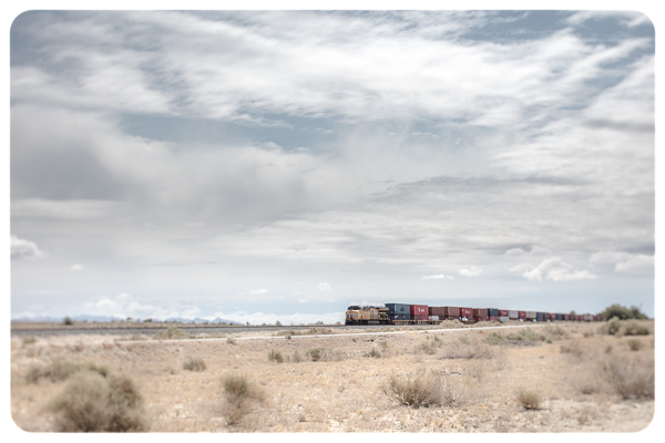
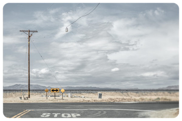
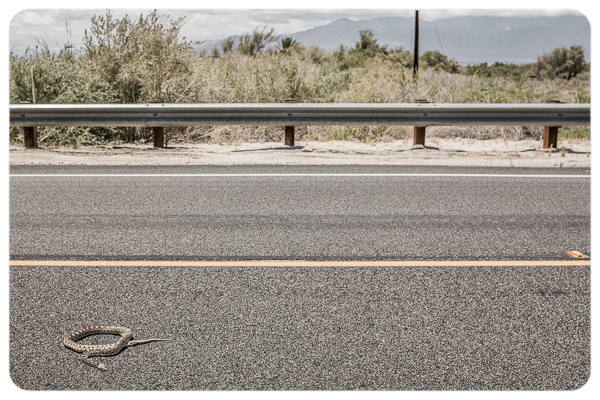
Earlier this month I had the opportunity to take a day trip around the Salton Sea area in California. Knowing that I would only have a single afternoon to photograph, my goal was to return with 8-10 images that would work together to convey not only what I saw, but what I felt as I drove through the area.
I limited myself to one lens – a 45mm tilt-shift. By using using the tilt control on the lens I was able to throw large portions of the image out of focus as well as create the illusion of making elements in the scene appear miniature. I was hoping that this “miniature” effect would make the images appear more mysterious and surreal, while the limited focus would help guide the viewers eye through the scene that might otherwise be thought of as a “image of nothing”. Because even in nothing, there is always something – even if it’s the lack of something that tells the story.

Limiting my equipment would help save time (no lugging of equipment), ease the decission making process (finite options), and ultimately allow my mind to focus more on the image (content and composition) and less on the technical. As I drove down the east coast of the Salton Sea and then back north and south again to see the west side, the clouds came and went, changing the quality and direction of light, making the original raw captures seem a bit disjointed. While using the tilt-shift lens, limiting the depth of field, and photographing similar subject matter, were three great techniques for creating a cohesive body of work, there were a number of refinements that I could make in post to further unify the images.

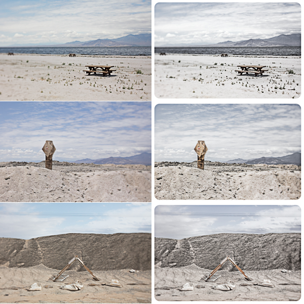
In Lightroom, I used the Temperature and Tint sliders in the Basic panel to equalize white balance across the series of images. I used the Tone sliders to set black and white points (extending the dynamic range for the images that were taken when cloudy), refine exposure and contrast, and shift shadow and highlight values. Increasing the Clarity slider added add a bit more “snap” to the images by amplifying edge contrast in the midtones. I also relied heavily on the HSL sliders to make a continuum of changes in different color ranges (desaturating the blue sky and lightening the green foliage. I switched to the selective adjustment tools to remove color or change tone in specific areas. Finally, I added a post crop vignette to round the corners (making the images look a bit more retro).
Below are three examples of these global and selective changes. The images on the left are the raw captures, the images on the right are post-processing in Lightroom.

I have published the finished images as diptychs here, to my Behance page.

Next time I visit (because I definitely want to return), I’d like to venture into Bombay Beach. There was police activity when I drove past and to be honest, I got a little spooked and left. : (
Just to clarify, did you synch the images in LR as you made these adjustments? Great series! Thanks for sharing.
I was able to sync the setting in Lightroom to give each of the images a similar starting point, but then needed to refine each one individually.
Thank you! You took the “usual” and turned into something better I’ll try the same procedures.
Julianne, thanks for the post, excellent as usual. When you return to the Salton Sea check out Salvation Mountain, very colorful.
Great job, brings back memories. I was out that way for work a few years back about half way down the east side. I really like your story telling approach.
These are beautiful, Julianne, just beautiful. I’ve gone through that area a few times, thinking of a cohesive series, but haven’t gotten there yet. This gives me a little bit of inspiration.
Rick