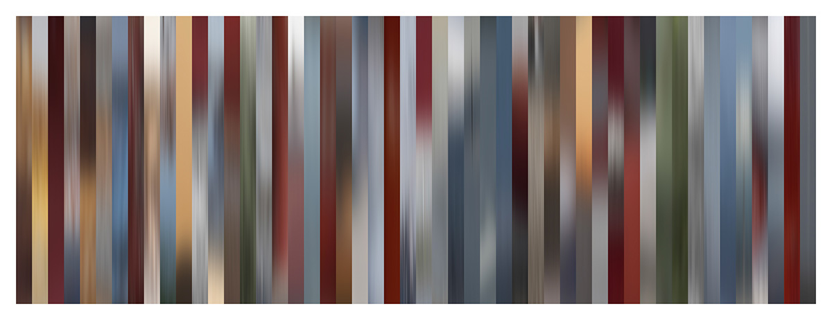
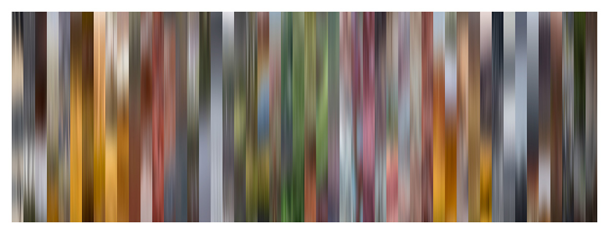
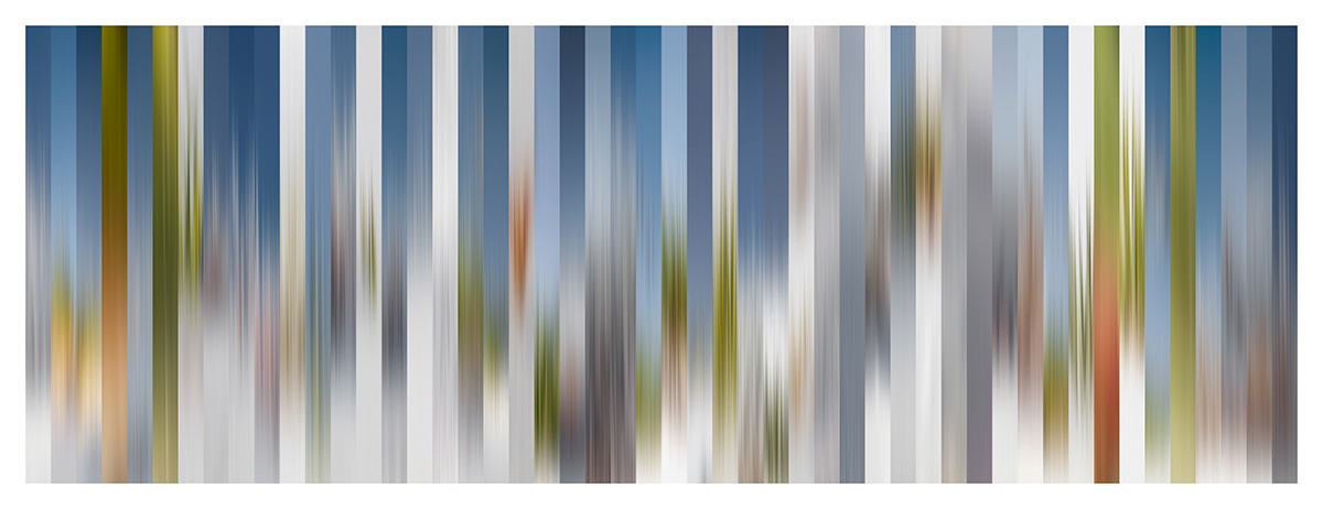
Does every location have a unique, identifiable color palette that can define it? That was the question I asked myself during my last photography projected where I explored how color affects the process of making a photograph, the photograph itself, as well as how that photograph is interpreted by the viewer. I had the pleasure of sitting down for an interview with my friend Lex van den Berghe to discuss “Color of Place” from concept to fruition, which he has shared here, on the Adobe Blog. Here are three of my favorite images from the series:
While I found it to be a rewarding project in and of itself, it also reinforced the importance of self-alignments as a way to improve our craft and gain personal insights into our work.
I’ll be posting additional images on my instagram account as well (@jkost).
Enjoy!


Julianne,
How did you get the colors of the photos laid out like this.
Thank you,
Richard
Color Palettes are indeed the new killer feature in Photography.
In addition to those you mentioned, I really like a tool created by Nino Batista to analyze and extract color palette from an image in Photoshop – NBP ColourmapX.
It allows color palette / style transfer between two images.
Really cool stuff…
Julianne,
It’s interesting to compare your approach and observations regarding photographic color palette and place to those made by watercolor painter Mimi Robinson in her 2015 book Reading Local Color. She collects color palettes characteristic of places around the world, which she makes by mixing watercolors on location and arranging in matrices. Like you, she ponders the experience and memory of place through color palette.
Best,
Tim
Thank you for the info – I just purchased her book and look forward to reading what she has to say about color! -j