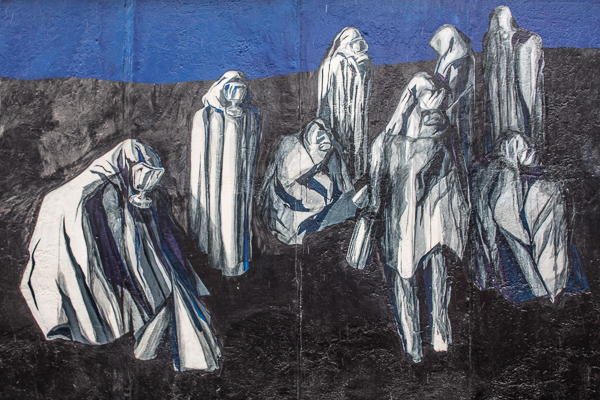
Last month I had the opportunity to visit Berlin. It was cold, the weather shifting between snow flurries and rain – a perfect time for making photographs! I was staying on the east side of the city, so I started by walking towards the remains of the Berlin wall. I don’t typically make photographs of other peoples art, but these murals really made an impact on me.

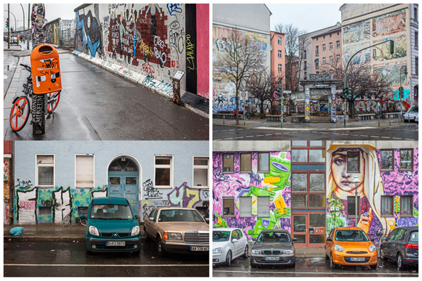
The two color images were from the Berlin Wall while the others are from nearby buildings.
I enjoyed the interesting mix of artistic murals (street art) which add to the character of the city, but was surprised by the abundance graffiti tags. (I understand, they’re both a form of personal expression, but IMHO, I don’t understand the act of vandalizing property – especially when it is placed on top of another mural, with a “tag”. But perhaps it’s cultural, and I just don’t “get” it.)
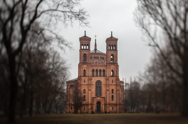
Continuing on my walk, I passed by St. Thomas church.
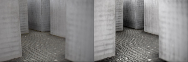
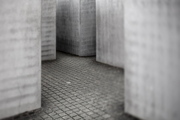
And a short distance farther, I arrived at the Memorial to the Murdered Jews of Europe. Once I started descending into the (two thousand, seven hundred and eleven) gray concrete slabs (stelae), I found it disorienting and claustrophobic. “According to Eisenman’s project text, the stelae are designed to produce an uneasy, confusing atmosphere, and the whole sculpture aims to represent a supposedly ordered system that has lost touch with human reason” -Wikipedia

Although I didn’t make drastic changes to most of my images in post, below is an example of some subtle changes made to the image in Lightroom.
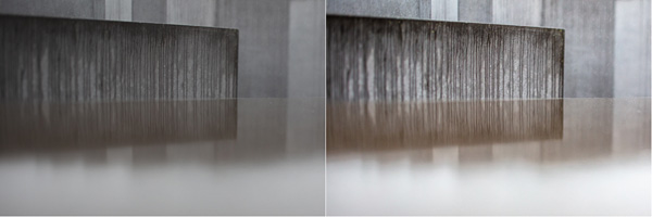
Before/After —Extending the dynamic range of the original capture as well as adding contrast (which also increased saturation), and clarity in the Basic panel gave the image the impact that I was looking for.
In the image below, I made enhancements in both Lightroom and Photoshop.
Before/After —Correcting perspective using Guided Upright in the Transform panel as well as increasing the dynamic range and adding contrast was a good start.
Taking the image into Photoshop, I was able to remove the distracting pebbles (healing brush and Clone Stamp) as well as even out tonality in the squares (Curves adjustment layer). I decided to leave one square lighter than the others for interest.
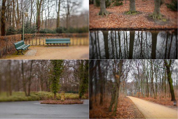
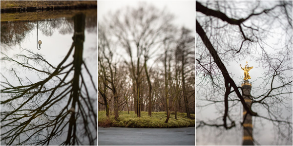
Next, I wandered through the Tiergarden, exploring the many pathways and gardens.
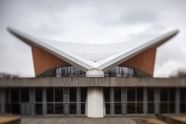
I made a quick detour past the Haus der Kulturen der Welt and Marie-Elisabeth-Lüders-Haus.
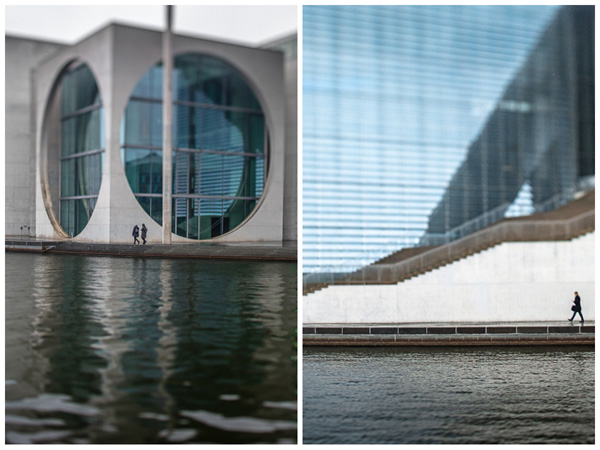
On the way back to the hotel, I stopped at the Berliner Dom and Alexanderplatz. I always like to try to find unique views that include the old and the new within a single image.

Finally, an idea that I’ve long been wanting to experiment with is to create a single, panoramic image from my favorite photographs from a location see if I can create a image that represents the “color” of the location or place. Of course, the resulting image would be dependent on the time of my visit, the areas I chose to go to, the subjects I decided to photograph, and my mood, but I don’t think those biases are any different than the ones that affect all of the other photographs that I take. Here is the first result. Each strip of color is one inch wide – I can’t wait to print it large!

I absolutely love the muted color palette of Berlin. Perhaps it was because I was feeling under the weather (in fact, when I returned, I came down with the chicken pox!), and I look forward to experimenting with other “Colors of Place”.
Hi Julieanne!
Amazing shots and a pretty cool idea, creating such a “pano”!
I´ve tried to reverse-engineer that 😉
Have You put Your images by layers into one file, blurred each one and cutted the/some parts of each by an action or are they compressed and You stringed them from left to right? Or….??? 🙂
regards
Markus
Here’s what I’m doing: Export files from Lightroom Classic as psd files. Run action that allows me to crop, convert to Smart Object, add path blur save and close. Open 52 in x 20 inch doc and drag and drop the files into it. Run action to distribute the files, add layer masks in correct location for each image and unlink them from the layers. Reposition each of the “panels” (because they are 2x the width so I can adjust them if I prefer one area over another). Run another action that selects all, Copies Merged and pastes it to another layer, converts it to a Smart Object, and adds another path blur. Then, one more action that adds a white border around the image. Of course you can do this with out actions, but I wanted to create more of these in the future so I thought it might be helpful. I hope that helps, julieanne
Thanks for that!
I´ve started similar, but finally used the contact sheet… 😉
Dear Julienne,
This is to say that I enjoyed your blog. Your journey through Berlin, described using a combination of image and text was very thoughtful. When I am in an appropriate context I will try something similar.
Also. I would like to know more about how you produced the ‘Colors of Place’.
Kind regards,
Ken
Dear Julienne,
With hope you are well again after chicken pox.
In 1986/7, I lived in Munich in a cold and rainy year. That was before the wall came down so I didn’t get to Berlin. Your pictures brought me back. I took my 8×10 to Germany but it was so impractical there.
I was fortunate to get a slot in the July SFPW compositing class so I am hard at work making sure I am as ready as I can be. Current work is on my Adobe Portfolio site below.
So looking forward to meeting you in Sante Fe.
Any extra notes on getting ready are welcome.
stay well – Bob
Hi Robert, I look forward to our week in Santa Fe! -j
Hi,
I enjoy your photos and really like the idea of developing a color palette for a location.
I was wondering about what camera(s) you use?
Sincerely,
MK
Nothing wrong with photographing street murals as a personal remembrance. The “problem” arises when you show the photograph to someone else, and they say “Great Photograph.” They are responding to the other person’s art, not your photograph. The “rules” change when people are introduced into the scene, so that there is a visual interaction or message being conveyed. Now the photographer has brought something to the table.
I find three dimensional sculpture to be a little more complicated. I like playing with light and shadows. The sculpture functions as a head for a portrait.